How I learned QGIS through real telecom problems at Orange, trained field teams with QField, and turned recurring geographic analyses into GeoPandas, Streamlit, and Folium applications for non-technical users.
When I arrived at Orange, I did not know that geographic information systems were about to become a significant part of my daily work.
I knew data.
I knew Python.
I understood that coordinates represented locations, which already placed me slightly ahead of anyone trying to open them directly in Excel.
But I had never seriously used QGIS.
Then I was introduced to client coordinates, network infrastructure, collective service incidents, sub-distributors, shapefiles, communes, IRIS zones, open datasets, and several geographical layers that did not always agree with one another.
The message was essentially:
Here is the territory. Here is the data. Please make them correspond.
So I learned QGIS.
Quickly.
Geography entered the workflow
Most business data is presented as rows and columns.
A client has an identifier.
An incident has a date.
A network element has a name.
A deployment has a status.
Then someone adds latitude and longitude, and suddenly every question becomes more interesting.
Where are the clients affected by this incident?
Which commune contains this coordinate?
Which IRIS zone does this address belong to?
Which network area overlaps this territory?
Where should a future antenna be prioritized?
Which neighbourhoods are confirmed for fibre deployment and could therefore be targeted by a marketing campaign?
These questions could not be answered properly by looking at spreadsheets alone.
The data had geography.
QGIS made that geography visible.
It allowed me to combine internal network information with administrative boundaries, public datasets, shapefiles, communes, IRIS zones, and data obtained through platforms such as Data.gouv.
A table could tell me that two records existed.
A map could tell me they were occupying the same place.
Sometimes when they absolutely should not have been.
Learning with real data
There is a comfortable way to learn software.
You follow a tutorial.
You download a clean sample dataset.
Every column has a sensible name.
Every geometry is valid.
Every coordinate system has been selected correctly.
You click the button shown in the video, and the expected result appears.
I did not learn QGIS that way.
I learned it with operational telecom data.
The layers were connected to real infrastructure, real clients, real territories, and real decisions.
That made the learning process less predictable, but much more useful.
I had to understand concepts such as:
- coordinate reference systems;
- vector layers;
- points and polygons;
- attribute tables;
- spatial joins;
- administrative boundaries;
- overlapping geometries;
- duplicate records;
- point-in-polygon matching;
- shapefile limitations;
- geographic data coming from several sources with several interpretations of reality.
QGIS was not only a way to display maps.
It became a way to inspect the quality of the underlying data.
And the data had opinions.
Redrawing the network, one polygon at a time
One of my tasks involved the geographical areas associated with sous-répartiteurs, or SRs.
Some of these areas overlapped across the French overseas territories.
This was a problem because a geographic boundary is not very useful when several zones simultaneously claim responsibility for the same location.
The elegant solution would have been to receive a perfectly cleaned and authoritative dataset.
The available solution was me.
I manually traced and corrected the overlapping SR territories.
One by one.
Across overseas territories.
There is something strangely meditative about editing polygons for long periods of time.
You move a point.
You adjust a boundary.
You check the neighbouring shape.
You discover another overlap.
You begin developing personal opinions about vertices.
The work was manual, but it was not trivial.
Correcting these areas required understanding what each geometry represented, comparing layers, preserving territorial coherence, and ensuring that the result remained operationally meaningful.
A polygon can be visually clean and still be wrong.
Unfortunately, QGIS does not provide a button labelled:
Make this correspond to how the network actually works.
Finding and correcting duplicates
Geographic data has a useful quality: errors often become visible.
Two rows in a spreadsheet may look harmless.
Place them on a map, and they may reveal two identical points occupying the same coordinate, multiple records representing the same infrastructure, or geometries duplicated across layers.
Part of my work involved identifying and correcting duplicates.
The difficulty was not only finding records that looked similar.
It was determining whether they were genuinely duplicated or whether two related objects happened to share similar attributes or locations.
This meant combining geographic checks with attribute-level validation.
The map showed where the problem might be.
The data helped explain what the problem actually was.
This became one of the recurring lessons of my work with GIS:
Visualisation is excellent at revealing that something is strange. It does not automatically tell you why.
That part still requires investigation, context, and occasionally asking someone who remembers why the dataset was created that way five years earlier.
From maps to 5G priorities
The work was not limited to cleaning existing geographic information.
I also used spatial analysis for an antenna-prioritisation study related to future 5G deployment.
This changed the role of the map.
It was no longer only describing the current network.
It was helping examine where future infrastructure could be most relevant.
Geographic analysis makes several kinds of information comparable in a shared space.
Network elements, administrative areas, service information, client locations, and territorial characteristics can be layered and studied together.
The result is not a magical map that makes the decision for you.
It is a way to structure the decision.
That distinction matters.
A map can make a recommendation appear objective simply because it is colourful and contains several polygons.
But the quality of the result still depends on:
- the quality of the source data;
- the criteria selected;
- the assumptions behind the analysis;
- the completeness of the layers;
- the interpretation of the person using it.
QGIS helped make the relationships visible.
It did not remove the need for judgment.
Apparently, software continues to refuse responsibility for our decisions.
Mapping fibre deployment for marketing
Another analysis focused on identifying neighbourhoods where fibre deployment had been confirmed.
The objective was to support geographically targeted advertising campaigns.
This was a different use of the same core capability.
Instead of asking where infrastructure should be deployed, the question became:
Where is the infrastructure sufficiently confirmed for communication to begin?
That required connecting deployment information with geographic areas that could be understood and used by teams outside a GIS workflow.
A technical deployment status is useful to an infrastructure team.
A clearly identified neighbourhood, commune, or zone is useful to a marketing team.
The analysis helped translate one into the other.
This is one of the things I came to appreciate about geographic work: the map often acts as a shared interface between departments that otherwise describe the same territory in completely different ways.
The network team sees infrastructure.
The marketing team sees potential customers.
The field team sees places they have to physically reach.
The client sees their street.
The geometry remains the same.
The questions do not.
Taking the maps into the field with QField
Desktop analysis was only one part of the work.
I also had to introduce teams to QField and teach them how to use it through workshops.
QField made it possible to bring QGIS projects and geographic data into a mobile field workflow.
This meant the maps were no longer limited to an analyst’s computer.
They could be used by people working directly in the territory.
Teaching the tool was a different challenge from learning it.
When I was working alone, I could tolerate an unclear workflow because I knew what I had intended.
During a workshop, that explanation becomes less convincing.
Field agents needed to understand:
- what information was available;
- how to navigate the project;
- how to locate relevant features;
- how to work with the map from a mobile device;
- how geographic information connected to their operational tasks.
The workshops forced me to think about the usability of the entire workflow.
A technically correct GIS project can still be difficult for someone else to use.
Layer names matter.
Symbology matters.
The order of information matters.
Instructions matter.
The fact that I personally understood the project after several weeks of working on it was not, surprisingly, a complete user-experience strategy.
The QGIS Server that never happened
As the use of geographic information grew, I also studied the possibility of deploying a QGIS Server within the department.
The idea was to move beyond isolated desktop projects and explore a more shared GIS infrastructure.
A server could have helped centralise geographic resources, expose map services, reduce duplicated project files, and make selected analyses more accessible.
I investigated the possibility.
It never reached production.
Not every technical initiative becomes an implemented system.
Sometimes the value is in identifying what would be possible, understanding the architectural requirements, and discovering the organisational constraints around it.
A server is not only software that needs to be installed.
It also introduces questions of:
- hosting;
- security;
- access control;
- data ownership;
- maintenance;
- responsibility;
- availability;
- integration with existing infrastructure;
- who receives the call when it stops working.
The answer to the final question is usually an important architectural dependency.
Although the project did not go further, studying it changed how I thought about GIS.
QGIS was no longer just a desktop application.
It could be one part of a larger system for storing, processing, serving, and sharing geographic information.
That idea later influenced the tools I built myself.
Reproducing QGIS workflows in Python
As useful as QGIS was, not every recurring question needed someone to open a desktop GIS project and manually repeat an analysis.
Many colleagues who needed geographic answers were not GIS specialists.
They did not need to learn layer management, coordinate systems, spatial queries, or the emotional consequences of an invalid polygon.
They needed an answer.
So I began reproducing parts of my QGIS workflows in Python.
I used GeoPandas for operations including:
- spatial joins;
- point-in-polygon matching;
- connecting coordinates to geographic areas;
- reproducing analyses that had previously required QGIS.
The logic was often straightforward in principle.
Take a collection of points.
Take a collection of polygons.
Determine which point belongs to which polygon.
Return the associated geographic information.
In practice, this also meant handling coordinate systems, missing values, inconsistent columns, invalid inputs, and every other detail that waits quietly behind the phrase “just perform a spatial join.”
The advantage was repeatability.
Once the analysis existed in code, I could run the same process again without reconstructing every step manually.
QGIS helped me discover and validate the workflow.
GeoPandas helped me formalise it.
Making the analysis usable with Streamlit and Folium
Code alone would not solve the accessibility problem.
A Python script is reusable for someone who is comfortable running Python scripts.
That description did not apply to every field agent, manager, or non-technical colleague who needed the result.
So I built internal applications with Streamlit.
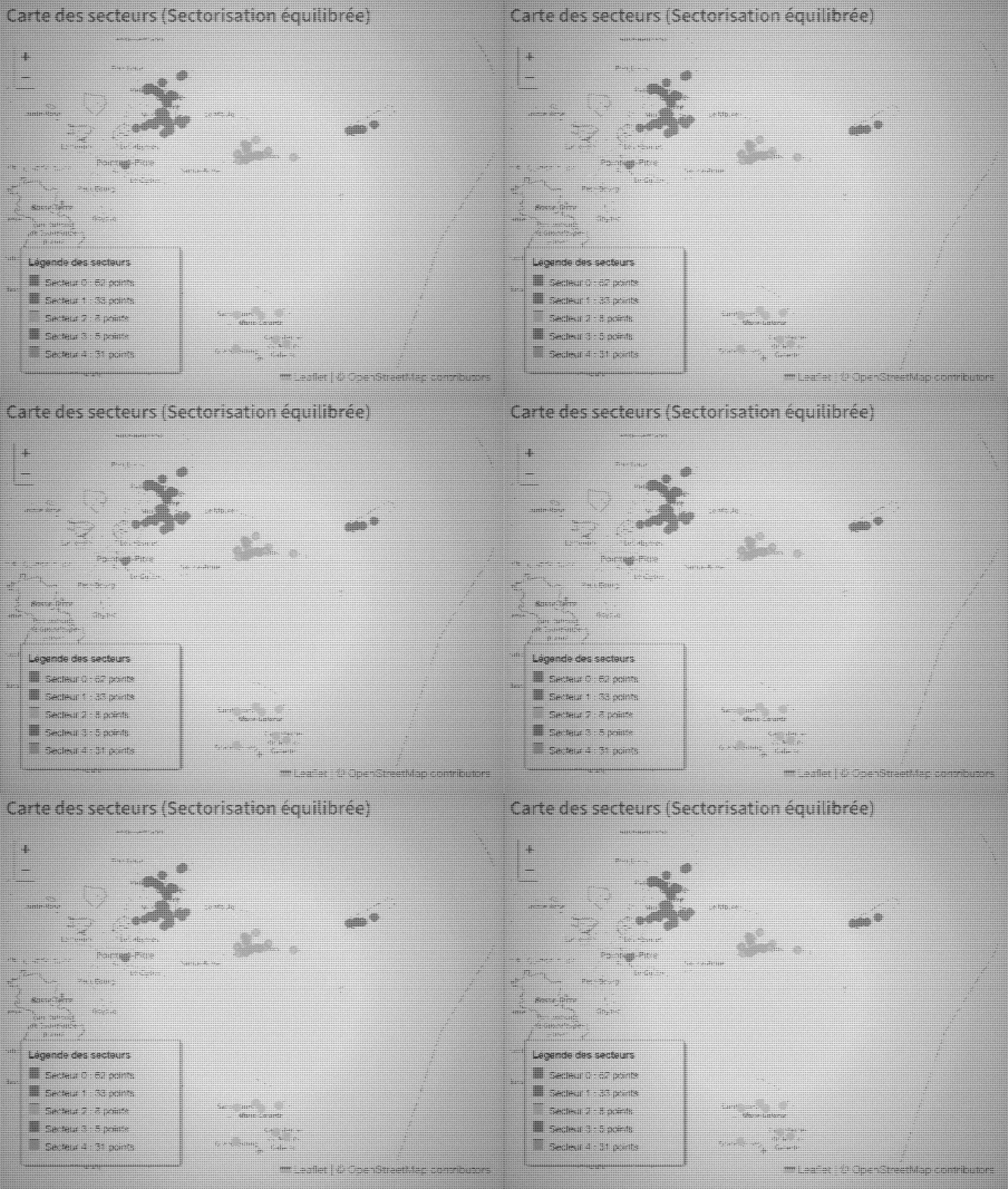
I used Folium to display interactive maps and created interfaces that allowed colleagues to access geographic analyses without needing to use QGIS directly.
One application allowed users to perform clustering for marketing purposes.
The workflow could take geographic information and present grouped results through an interface designed for the actual business question.
The user did not need to know how the spatial processing worked.
They needed to select the relevant inputs, run the analysis, and interpret the result.
That was the point.
I also created other applications to automate recurring Excel work.
The pattern was the same:
- Someone regularly asked a question.
- I performed a sequence of manual operations to answer it.
- The question returned.
- The sequence returned.
- I began reconsidering my relationship with repetition.
- The process became an application.
These tools were not theoretical prototypes that I built once and forgot.
I used them every day.
They became part of my own workflow and helped automate many of the questions people regularly brought to me.
Automating the question, not only the answer
The most useful automation was not necessarily the most technically complex.
It was the automation that removed a repeated dependency.
Before an app existed, someone needed an analysis.
They asked me.
I opened the relevant files.
I reproduced the steps.
I checked the result.
I returned the answer.
Then a similar question arrived later.
Building an application changed that relationship.
The analysis became available through a repeatable interface.
Field agents, managers, and non-technical colleagues could use a workflow that previously depended on direct GIS knowledge.
This did not eliminate my role.
It shifted it.
Instead of answering the same geographic question repeatedly, I could improve the method used to answer it.
That is the kind of automation I find most valuable.
Not replacing knowledge.
Turning knowledge into a reusable system.
I built them because I wanted to try
There was also a less strategic reason behind these tools.
I had always wanted to try building them.
The repeated analyses gave me a real reason to experiment with GeoPandas, Streamlit, and Folium.
Instead of creating a demonstration application around an artificial dataset, I could work from actual recurring needs.
That made the development process more useful and more demanding.
The applications had users.
The results had consequences.
The interfaces needed to make sense to people who had not watched me build them.
The data would not politely conform to the demo.
This is where a tool stops being only an experiment.
It becomes part of a workflow.
And once it becomes part of a workflow, people become remarkably effective at discovering every assumption you forgot to test.
What each tool gave me
Looking back, each part of the stack served a different purpose.
QGIS made the geography visible
It helped me explore layers, inspect data, correct geometries, understand spatial relationships, and build analyses interactively.
QField brought the geography into operational use
It helped make geographic projects accessible to teams working outside the desktop environment.
GeoPandas made the analysis repeatable
It allowed me to translate recurring spatial operations into code.
Streamlit made the analysis accessible
It gave non-technical users a way to run workflows without learning GIS software or Python.
Folium made the results readable
It turned processed geographic data into interactive maps that could be explored through a browser-based interface.
Together, they changed my work from producing individual maps to building systems around geographic questions.
What GIS taught me
Before working with QGIS, I thought of geographic data mainly as coordinates and boundaries.
The experience taught me that geography is often the missing dimension in an operational question.
A duplicate is not only another row.
It may be two objects occupying one location.
A deployment is not only a status.
It belongs to a territory.
A client incident is not only an event.
It affects an area and the people inside it.
A marketing opportunity is not only a segment.
It exists somewhere.
GIS made those relationships easier to see.
Programming made them easier to repeat.
Building applications made them easier to share.
The most important result was not a specific map, script, or dashboard.
It was learning how to move between those layers of work:
understand the problem visually, formalise it technically, and make the solution usable by someone else.
I arrived at Orange needing to learn QGIS.
I ended up using it daily, correcting telecom geography, supporting infrastructure and marketing analyses, training teams with QField, exploring shared GIS infrastructure, and rebuilding recurring spatial workflows with Python.
That is slightly more than I expected from opening my first shapefile.
Not final.
Just spatially joined.